

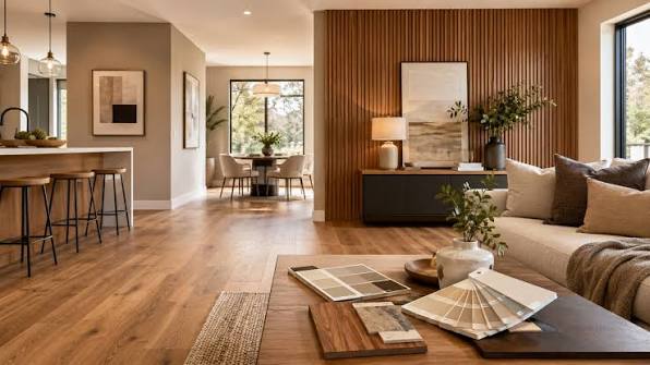
Hardwood floors and neutral walls provide a versatile foundation for interior design, but choosing furniture finishes that work with both can be surprisingly challenging. A room with beige walls and oak flooring, for example, may feel warm and inviting with the right wood tones, yet appear flat or overly yellow if every surface shares a similar shade. The solution lies in understanding undertones, balancing materials, and creating enough contrast to give each element its own presence.
Rather than matching every finish precisely, homeowners can build a cohesive interior by selecting furniture that responds to the existing colors and textures. A thoughtful combination of wood, metal, upholstery, and painted surfaces adds depth without making the room feel visually crowded.
Identify the Undertones in Your Hardwood Floors
The first step is to evaluate the flooring in natural and artificial light. Hardwood floors can have warm undertones, such as honey, red, or golden brown, or cooler undertones that lean toward gray, ash, or muted brown. Some woods, including white oak, offer relatively neutral coloring, making them adaptable to several design directions.
Wall color matters just as much. Cream, ivory, and warm beige generally pair well with golden or reddish wood, while cool gray walls often complement ash-toned flooring. Greige and soft white can work across a broader range, although their undertones influence which combinations look most natural.
Use Samples Instead of Relying on Memory
Flooring can look dramatically different under morning sunlight, warm evening bulbs, and overhead LED lighting. Bring furniture finish samples, paint swatches, or fabric samples into the room and compare them directly against the floor.
Look for harmony rather than an exact match. A walnut coffee table against light oak flooring, for instance, creates deliberate contrast while preserving a natural wood palette. The two finishes feel related because they share an organic texture, even though their colors differ.
Create Contrast Without Introducing Visual Clutter
Rooms become visually monotonous when the flooring, furniture, and walls all occupy nearly the same tonal range. Contrast helps define individual pieces and gives the space dimension.
Pair Light Floors With Deeper Furniture Finishes
Pale oak, maple, and lightly stained hardwood floors can support furniture in walnut, espresso, or medium brown finishes. These darker tones establish visual weight and prevent an airy room from feeling unfinished.
For a softer approach, consider natural linen upholstery, warm white cabinetry, or furniture with subtle black accents. The result retains brightness while introducing enough variation to make the design feel intentional.
Balance Dark Hardwood With Lighter Elements
Dark walnut, mahogany, or espresso-toned floors can make a room feel grounded, but too many dark finishes may absorb light and visually shrink the space. Light oak furniture, cream upholstery, and pale stone accessories help offset that effect.
A medium-toned wood dining table or sideboard can bridge the difference between dark floors and light walls. This middle layer is especially useful in open-plan homes, where furniture must connect different areas without creating abrupt color changes.
Mix Wood Finishes With a Consistent Design Logic
Using the same wood finish throughout a room is not essential. In fact, mixing finishes often produces a more collected, natural appearance than purchasing every piece from one matching set.
The key is to vary finishes deliberately. Combine a prominent wood tone with one or two complementary shades, then repeat those colors in smaller details such as picture frames, shelving, or occasional tables.
For example, a living room with natural oak floors might feature a walnut media console, a black metal floor lamp, and a sofa upholstered in warm gray fabric. Each material contributes a different texture, while the limited palette keeps the arrangement cohesive.
When comparing case goods, tables, and seating options at retailers such as RC Willey, consider the finish alongside the item’s silhouette, upholstery, and visual weight. A slim walnut console may complement a room more effectively than a bulky piece in a closer-matching stain.
Consider Metal, Fabric, and Painted Finishes
Wood is only one part of the finish palette. Metal hardware, upholstery, and painted furniture can help connect hardwood floors with neutral walls.
Black metal introduces crisp definition, particularly in contemporary or transitional interiors. Brushed brass and bronze contribute warmth, while chrome and brushed nickel tend to suit cooler palettes. These are guidelines rather than strict rules; the surrounding materials determine whether a finish feels integrated.
Textiles provide another opportunity to balance the room. Bouclé, linen, wool, and textured cotton soften the hard surfaces of wood and metal. Upholstery in olive, muted blue, charcoal, or clay can add color without overwhelming neutral walls.
Common Questions About Furniture Finishes
Should furniture match hardwood floors?
No. Exact matching can make individual pieces disappear into the background, and wood species often develop different colors over time. Coordinating undertones and varying lightness usually creates a more dimensional result.
Can warm and cool wood tones work together?
Yes, provided the combination feels intentional. Introduce a connecting element, such as neutral upholstery, a patterned rug, or repeated metal accents, to help different finishes relate to one another.
Which furniture finish works best with gray walls?
Natural oak, walnut, black, and muted painted finishes can all work with gray walls. The best choice depends on whether the gray leans warm, cool, or neutral and on the undertones of the hardwood floor.
Build a Palette That Works Over Time
Furniture finishes should complement the permanent features of a home without limiting future decorating choices. Start with the undertones of the floors and walls, introduce contrast through wood and upholstery, and repeat a few finishes to establish continuity. Testing samples in the actual room is often more reliable than following a fixed color rule.
When materials share a compatible visual character but differ in tone and texture, the result feels balanced rather than overly coordinated. That flexibility makes it easier to update accessories, introduce new furniture, and maintain a cohesive interior as tastes change.

