

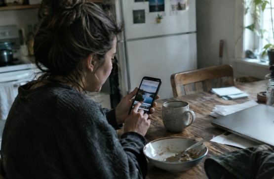
Highly polished content is everywhere, from branded social posts to product launches and creator feeds. That abundance can make a slightly rougher visual feel more human, especially when it looks connected to a real moment rather than a studio production. A low quality image maker can help creators explore grain, compression, faded color, and imperfect framing, but the effect should always support a story first.
Lo-fi does not mean careless. It means making deliberate choices that leave room for texture, context, and personality. Used well, a visual that is not perfectly sharp or polished can invite viewers to slow down and consider what they are seeing.
1. Why Perfect Visuals No Longer Stand Out
Clean lighting, smooth retouching, and tightly planned composition still have their place. They can communicate care, consistency, and professionalism. But when every image follows the same visual formula, viewers may read it as promotional before they read it as meaningful.
At the same time, people have more reasons to question what they see online. Generative tools and image editing can produce convincing media quickly, so polish alone cannot prove that an image is accurate or trustworthy. Research on media authenticity methods explains why provenance, watermarking, and other verification approaches matter alongside visual judgment. A rough image is not automatically more truthful, but it can feel less rehearsed when its style fits the situation.
2. What Makes a Lo-Fi Image Feel Believable
Lo-fi visuals are images with visible limits or irregularities that feel intentional rather than broken. The style is broader than low resolution. It may include natural lighting, slight motion blur, soft grain, muted detail, rough cropping, uneven exposure, or the faint artifacts of sharing an image across platforms.
Believability often comes from restraint. One or two details, such as a slightly off-center frame and a mild film-like texture, can create a lived-in feeling. Adding blur, scratches, noise, color shifts, and heavy compression all at once can make the treatment look artificial.
3. The Difference Between Authenticity and Poor Quality
Quality describes how clearly an image is rendered. Authenticity describes whether the image, caption, and surrounding context give people a fair reason to understand what they are looking at. A blurry photo can be staged. A crisp image can be an honest record of a real event.
That distinction is essential for creators. Lo-fi design should clarify the emotional tone of a story, not disguise weak ideas or create a false sense of documentary truth. The strongest work makes viewers feel something while remaining clear about what is real, recreated, edited, or imagined.
4. How Visual Imperfections Support Storytelling
Small flaws can communicate details that a pristine image may not. Grain can suggest memory or a past era. A rough screenshot can capture the speed and messiness of an online moment. Uneven color can make a scene feel distant, reflective, or nostalgic. Soft focus can make a portrait feel private or emotionally removed.
The key is to connect the visual choice to the narrative. A story about rediscovering old family photos may benefit from faded color and texture. A first-person update from a busy event may feel more immediate with imperfect framing. If the effect does not add meaning, it is decoration rather than storytelling.
5. Choosing the Right Lo-Fi Style
- Soft grain: Useful for personal memories, lifestyle stories, and quiet reflective moments. It can create warmth and nostalgia.
- Heavy compression: Useful for internet culture, chat-based storytelling, and rapidly shared posts. It can suggest urgency or humor.
- Muted color: Useful for documentary-inspired or contemplative work. It can create distance and realism.
- Rough framing: Useful for diary-style, behind-the-scenes, and first-person content. It can create intimacy and immediacy.
6. A Simple Process for Creating Lo-Fi Visuals
- Start with the message. Define what viewers should understand or feel.
- Choose a visual point of view.Decide whether the image should feel remembered, observed, hurried, or personal.
- Limit the imperfections. Select two or three treatments, such as grain, color fade, or loose framing.
- Protect the subject. Keep faces, important objects, and necessary text recognizable.
- Review it on a phone. Check whether the image still communicates at a small size.
- Compare versions. Place the lo-fi edit beside a clean version and keep the treatment only if it improves the story.
7. When Lo-Fi Design Can Hurt a Message
Lo-fi is a poor fit when clarity is the central requirement. Distorted text, weak contrast, or excessive blur can make information difficult to access. Serious announcements, safety guidance, legal notices, and instructions should prioritize legibility and easy verification.
Forced imperfection can also damage credibility. A casual, damaged look may feel calculated when it does not match the speaker, subject, or setting. Keep essential details sharp, use descriptive alt text, and do not let a visual effect prevent viewers from understanding the point.
8. Ethics, Editing, and Audience Trust
Creative editing is not the same as deception. The ethical line is crossed when a treatment changes the apparent meaning of a person, place, event, or document without giving viewers the needed context. Do not present fictional scenes as evidence, and do not use vintage-looking effects to imply that a newly created image is historical.
Captions can explain when an image is recreated, composited, generated, or substantially altered. For sensitive work, retain original files and consider using provenance information about creation and editing to document an asset’s history. These tools can add context, although they do not replace careful reporting or honest labeling.
9. Common Questions About Lo-Fi Visual Storytelling
Does lo-fi mean low effort?
No. Effective lo-fi work depends on thoughtful decisions about composition, texture, timing, color, and context.
Can lo-fi visuals work for professional content?
Yes. Behind-the-scenes stories, founder updates, creative process posts, and community features can all benefit when the style fits the audience and purpose.
Should every image look damaged?
No. A subtle change in texture or color may be enough. Too many effects can overwhelm the content.
10. Conclusion: Let the Story Lead
Lo-fi visuals work best when they give a story a clearer emotional shape. A rough image can feel personal, timely, and memorable, but only when its imperfections belong to the subject. In 2026, the most effective visual storytelling will not always be the sharpest. It will be the work that gives people a reason to pause, understand, and trust what they see.

