
When a team asks for a logo, it often jumps straight to choosing a symbol. Yet a distinctive name in strong lettering may do more work than an icon, while a compact symbol may be essential where the full name cannot fit. The choice among a wordmark, a symbol, and a combination mark is a design decision before it is a style preference. An AI Logo Generator can make the three routes visible quickly, provided the team compares them against the same business needs. Begin by listing where the identity will appear, how familiar the audience is with the name, and what must remain legible at the smallest size. An AI Logo Creator then becomes a tool for structured comparison rather than a source of unrelated favorites.
Give Each Format a Clear Job
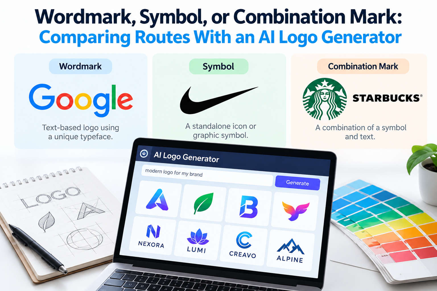
A wordmark puts the name at the center. It can help a new business build recognition when people have not yet learned a separate icon. Its strength depends on lettering, spacing, and how the name reads across widths. A symbol can travel into tighter spaces, but it may need repeated exposure before people connect it to the business. A combination mark places name and symbol together and can offer useful flexibility, though both parts must still feel deliberate. Ask an AI Logo Generator to explore each format using the same brand brief so the comparison is about structure rather than changing moods.
Create a simple decision sheet with rows for website header, social avatar, invoice, product label, and any other real touchpoint. In each row, record available space, viewing distance, and whether the brand name is likely to be seen elsewhere nearby. A wordmark may work beautifully on a page header and fail as a square avatar. A symbol may look neat in a tiny square yet say little on a first-contact sales document. These observations give the AI Logo Generator a practical frame for the next round of requests. They also keep AI Logo Generator results tied to actual placements.
Start with the name itself
The length, spelling, and rhythm of the name influence the right route. A short name with memorable letter shapes may reward typographic exploration. A long name may need a more compact arrangement or an accompanying symbol for small placements. Look at confusing letter pairs, narrow counters, and awkward line breaks before judging color or decoration. Generate several restrained wordmark treatments, then inspect them in black and white. If an AI Logo Generator repeatedly hides the hard parts of the name with effects, ask for a simpler treatment rather than accepting the disguise.
Compare Like With Like
Use one constant brief for the three routes. Describe the audience, category, tone, name, and usage constraints. Then request a wordmark-only direction, a symbol-led direction, and a combined direction. Keep the palette limited during the first pass so color does not dominate the vote. You can use an AI Logo Generator to surface candidate structures, but label the results by format before showing them to reviewers. A fair comparison asks which structure communicates the business most clearly in the places that matter.
Print or display every candidate at the same sizes. Compare a wide header, a small square, and a single-color version. A symbol that needs a caption to make sense may still be useful, but the team should understand that dependence. A combination mark that only works when every part is present may offer less flexibility than expected. An AI Logo Generator can produce attractive compositions that conceal these weaknesses at presentation size. Reducing the mockup to ordinary use removes that advantage. Apply the same reductions to every AI Logo Generator route.
Check the relationship between parts
For combination marks, inspect whether the symbol and wordmark seem to belong together. Do they share a similar visual weight, shape language, and level of detail? Can the symbol sit above, beside, or apart from the name without looking unrelated? A tiny icon beside very expressive lettering may feel like an afterthought. A complex icon paired with plain text may compete for attention. Ask the AI Logo Generator for controlled refinements to proportion and spacing instead of an entirely new aesthetic each time.
Use a Small Review Rubric
Score each format against four questions: Can a new viewer read or identify it? Does it fit the most important surfaces? Does it express the intended tone? Can the team reproduce it consistently? Keep the scale simple, such as strong, acceptable, or weak, and require one sentence of evidence for every rating. This avoids pretending that design can be reduced to a mathematical winner. It also keeps an AI Logo Generator review from becoming a vote based on personal taste.
Invite reviewers to describe what they saw before asking which version they prefer. Someone may remember the symbol but misread the name, or read the name while missing the visual idea. Those are different findings. If the team has little audience access, run the same exercise internally with people who were not involved in writing the brief. When an AI Logo Generator direction fails a test, record why before requesting another version. A good revision changes the relevant variable rather than starting over. That record makes the next AI Logo Generator request more focused.
The winning format does not need to solve every placement alone. A combination mark might be primary, with a simple wordmark for wide spaces and a symbol for small ones. That system only works if each version shares recognizable proportions or details. Do not invent alternate marks simply because the AI Logo Generator can produce them. Every variation should answer a specific usage need, and the team should know when to use it.
Make the Decision Usable
Once a route is selected, document the approved arrangement, minimum readable size, clear space, and acceptable color versions. Include examples of a crowded header and a plain document, because those are the places where improvisation often starts. If the choice is a wordmark, specify whether an icon may ever accompany it. If it is a symbol, explain when the name must appear nearby. A concise rule set prevents a promising AI Logo Generator concept from fragmenting into inconsistent versions after launch. Save the final AI Logo Generator decision beside the approved assets.
The broader AI Logo Creator process can help explore future applications, but preserve the reasoning behind the format choice. Revisit it when the business name, audience, or main touchpoints change, not whenever a new style appears attractive. Comparing wordmark, symbol, and combination mark routes on equal terms gives a team a defensible decision and a more adaptable identity than choosing the most polished image in a gallery.

