

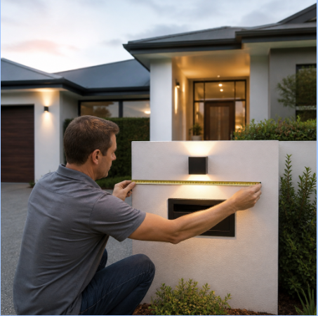
Most house numbers fail for one of two reasons: they are too small for the distance they have to travel, or they are mounted on a surface that swallows them. Neither problem is expensive to fix, but both are easy to get wrong — and once holes are drilled into fiber cement or stucco, a redo is a visible repair. This guide walks through the sizing math, the material and contrast decisions, and the installation sequence that makes the difference between numbers that look deliberate and numbers that look like an afterthought.
Start With the Viewing Distance, Not the Wall
Before you look at fonts or finishes, measure. Stand where a delivery driver or a first-time visitor would stop — usually the curb or the end of the driveway — and measure back to the spot where the numbers will live. That distance drives everything else.
A practical rule of thumb used by sign fabricators is roughly one inch of character height for every 25 to 30 feet of viewing distance for comfortable reading, and more if the numbers are read from a moving vehicle or at night. Translated into residential terms:
- Numbers beside the front door, 15–25 feet from the walk: 4 to 5 inches tall reads easily.
- Numbers on a facade set back 40–60 feet from the street: 6 to 8 inches.
- Numbers on a garage wall, a long rural driveway or a two-story elevation: 8 to 12 inches, or move them to a mailbox or gate post instead.
Two cheap tests save a lot of regret. First, print the numbers at full scale on paper, tape them up, and walk to the curb at dusk. Second, photograph the facade from the street with your phone and look at the image on a small screen — if you cannot read the numbers in the photo, a stranger will not read them from a car.
Horizontal, vertical or stacked?
Orientation is usually dictated by the available real estate. A narrow pilaster between windows calls for a vertical run; a wide band of siding above a garage door suits a horizontal line. Vertical numbers read slightly slower than horizontal ones, so if you choose a stacked arrangement, bump up the character height by an inch or add generous spacing between digits. Leave at least half a character width between numbers — tight spacing is the single most common cause of a “6” reading as an “8” at distance.
Contrast Beats Size Every Time
Large numbers on a low-contrast background disappear. Dark bronze on dark stained cedar, or brushed aluminum on light gray stucco, both lose legibility fast as light levels drop. The fix is either flipping the value — light characters on a dark field, or dark characters on a light field — or introducing a backing plate that creates its own contrast regardless of what the wall is doing.
Depth helps too. Characters standing off the wall on concealed standoffs throw a shadow in daylight, which effectively outlines each digit and adds a second layer of contrast. That shadow line is why floating numbers on a flat modern facade often outperform flush-mounted numbers of the same height. If your entry is in deep shade or faces north, consider a downlight or a sconce positioned so it rakes across the numbers rather than hitting them straight on.
If you are weighing where to put them at all, there are plenty of creative ways to display house numbers around an entry — risers on a front step, a planter, a fence panel, a transom above the door — and the right answer depends as much on sightlines from the street as on style.
Match the Numbers to the Surface They Land On
The wall material sets the constraints. Brick and stone mean drilling into masonry and placing anchors in mortar joints where possible. Stucco needs care: a dull bit, too much pressure, or no pilot hole will spall the surface. Lap siding has an uneven plane, so numbers mounted across two courses will not sit flush unless they are on standoffs or a plaque. Vertical board-and-batten gives you a rhythm you can either align with or ignore, but half-measures look accidental.
This is where exterior projects tend to overlap. If you are already planning a cladding refresh, hold off on the numbers until the wall is done — new siding is the best possible moment to place numbers precisely, with no patched holes left behind. Homeowners planning that kind of work often find that understanding how professional siding installation protects and improves a home’s appearance changes the order of operations for the whole exterior punch list, numbers included.
A note on mounting plates
An address plaque solves several problems at once: it guarantees contrast, it handles uneven or textured surfaces, and it reduces the number of holes you drill into the wall from a dozen to two or four. The trade-off is visual weight. On a minimal facade, a plaque reads as a deliberate object; on a busy elevation with shutters, trim and brick detail, individual floating numbers are usually quieter.
Where to Source Numbers That Hold Up Outdoors
Exterior hardware lives in sun, rain and temperature swings for decades, so material matters more than it does indoors — and so does the quality of the installation kit, because a template is what keeps a crooked line from becoming permanent. For homeowners and designers who want characters cut to a specific height, font and finish rather than whatever a big-box shelf happens to stock, a maker-direct route is worth considering: Modern House Numbers is a family-run business that has been precision-cutting custom numbers, letters, address plaques, welcome signs and mailbox decals from solid recycled aluminum since 2008, and its house numbers made in Tucson ship with a free personalized full-scale drilling template, step-by-step instructions and concealed hardware — the three things that make a DIY install land straight on the first attempt. There is a QuickShip range for tighter timelines, a trade program for designers and builders, and bespoke signage work for projects that need something outside the standard catalog.
The Install, Step by Step
- Dry-fit with the template. Tape the full-scale template in position and leave it up for a day. Look at it in morning and evening light, and from the curb.
- Check two reference lines. Use a level for horizontal alignment, but also check the numbers against a nearby vertical — a door casing, a window edge, a corner board. Numbers that are level but visually off-center from the door will still look wrong.
- Mark and pilot carefully. Use the correct bit for the substrate, start slow on masonry and stucco, and vacuum dust from the holes before setting anchors.
- Set the hardware, then the characters. Concealed studs should seat fully; do not force a character that is binding, as that usually means a hole is off by a fraction and needs enlarging.
- Clean up and reassess at night. Wipe the surface, then look again after dark with your porch light on. Adjust lighting before you decide the numbers are wrong.
Small Detail, Outsized Effect
Address numbers are one of the few exterior upgrades that cost little, take an afternoon, and get noticed by everyone who approaches the house. Get the height right for the viewing distance, give the characters contrast and a shadow line, respect the surface you are mounting to, and sequence the work so you are not drilling into something you plan to replace. Do those four things and the result reads cleanly from the curb at noon and at nine at night — which is the only test that actually matters.

